Crypton Branding
Official brand guidelines for Crypton. Logo variants, design tokens, typography, and downloadable assets for our dark glass UI.
Name
In the logo, "CRYPTON" is written fully capitalized. This capitalization is reserved for the logo only and should not be used in regular text. In texts, "Crypton" is written as a regular name, with only the first letter capitalized. In URLs or email addresses, the name should be written all lowercase, e.g., crypton.sh. The website is accessible only via crypton.sh.
Approved tagline: "Privacy-first connectivity. Encrypted by default." Use this line on auth, marketing, and partner surfaces unless a locale-specific translation is provided.
Logo
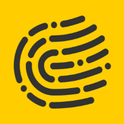
Primary mark (logo.svg)
Light mark (logo-alt.svg)
App icon
Structure & clear space
The Crypton logo features a fingerprint symbol integrated into the wordmark, representing privacy and security. Use logo.svg on Crypton gold or light backgrounds. Use logo-alt.svg on the dark glass canvas (auth, app, landing). The favicon is the fingerprint icon alone. Keep at least the height of the fingerprint icon as clear space on all sides.
Minimum clear space: one fingerprint-icon height on every side.
Color system
Crypton uses a dark canvas with frosted glass panels and gold accents. Semantic colors are reserved for status meaning only — not for brand CTAs or decorative backgrounds.
Status colors
Typography
Roboto — Body & UI specimen
Roboto is the primary UI typeface — body copy, form fields, app labels, and landing descriptions.
ABCDEFGHIJKLMNOPQRSTUVWXYZ abcdefghijklmnopqrstuvwxyz 0123456789
Poppins — Marketing heading specimen
Poppins is used for marketing headings, landing section titles, hero headlines, and emphasis.
Monospace — Monospace specimen
System monospace (ui-monospace, Courier) is used for code snippets, hex values, and technical identifiers.
UI surfaces
Auth cards, app account panels, and landing sections share the same glass material: dark gradient canvas, semi-transparent fill, backdrop blur, and a subtle inset highlight.
Frosted login/register panel on ambient canvas
Glass panel used across the authenticated app
Usage rules
Do's
Use the logo on solid Crypton gold or dark glass backgrounds with adequate clear space.
Build UI on the dark canvas with frosted glass panels — the pattern used across auth, app, and landing.
Use gold for primary actions and brand emphasis; reserve green, amber, red, and blue for semantic status only.
Don'ts
Don't use legacy flat grey or full-page yellow backgrounds from the old landing theme.
Don't place the logo on busy imagery or unapproved color fields that reduce legibility.
Don't allow the logo to touch or overlap other graphic elements.
Don't stretch, recolor, or distort the logo; don't use off-palette colors for brand CTAs.